
FitBud is the newest innovative mobile app to hit the fitness industry. FitBud helps fitness enthusiasts find the perfect training partner, whether it's a short term partner if you are travelling or a long term partner to train at home with. Not only that! Users can connect with their fitness partners and chat with them in the app itself. The match is based on location and fitness goals.


According to a study published in Nature Communications in April 2017 that analysed five years of data from over a million runners, MIT researchers discovered that exercise is "socially contagious," which means that the more runners you know, the more likely you are to go for a run. (The researchers used data from runners' digital fitness trackers, which included geographic locations, social network ties, daily running patterns, and pace, duration, and calories burned per run.)
Exercising with a partner may motivate you to increase the intensity of your workouts as well.
"Starting exercise is easy — the difficult part is continuing to exercise,” says Hirofumi Tanaka, PhD, a professor of kinesiology and health education at the University of Texas in Austin. “One of the predictors of success in terms of persistent exercise is the support of other people,” he says.


React Native and AWS Amplify offer a powerful combination for building mobile applications with seamless backend integration. React Native, as an open-source JavaScript framework, enables developers to create cross-platform mobile apps with a single codebase. Its component-based architecture simplifies the development process, saving time and resources. Additionally, React Native provides a native-like user experience, enhancing app performance. When paired with AWS Amplify, developers can rapidly deploy a scalable and secure backend for their applications. AWS Amplify simplifies tasks such as authentication, data storage, and API integration, making it easier to manage the server-side components. This combination streamlines the development process, allowing developers to focus on building great user experiences while AWS Amplify handles the complexities of the backend infrastructure, creating a highly efficient and productive development environment.


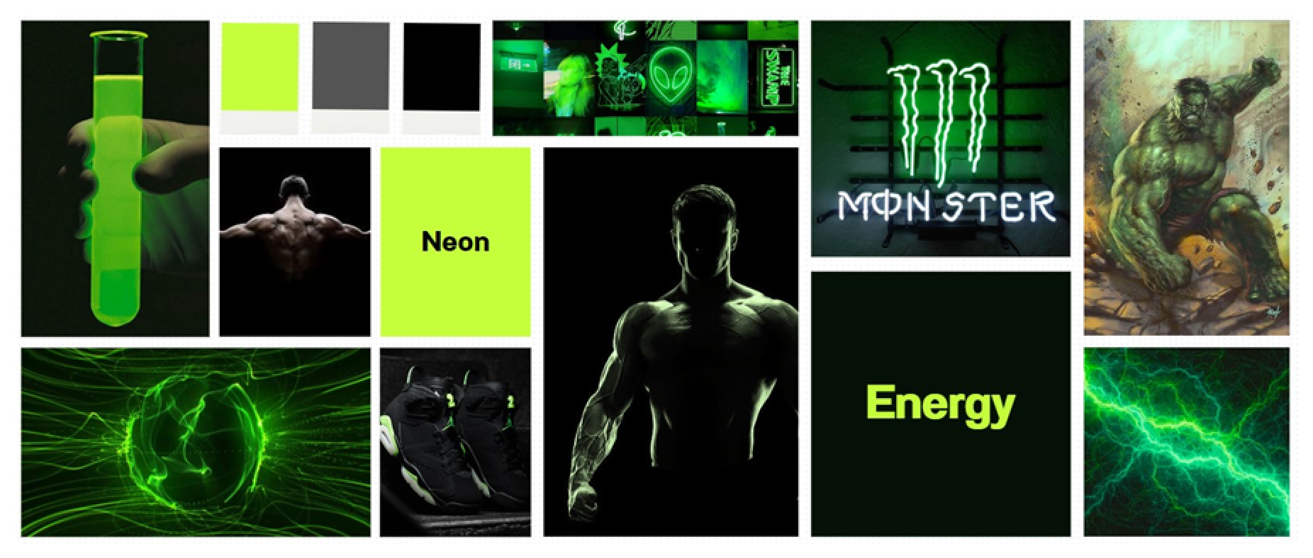
As a designer working on the FitBud app, I started the design process by creating a mood board to help me decide on the colour scheme for the app. After gathering inspiration from various sources, I was highly influenced by Monster Energy's vibrant green colour and the fictional character Hulk's appearance, which led me to choose neon green and black as the colour scheme for the app.

Next, I moved on to sketching out the basic layout and features for the app. To do this, I took direct reference from the popular dating app Tinder, which features a Swiping of Cards feature that allows users to swipe left or right on potential matches. I decided to incorporate this feature into FitBud's design, as it is user-friendly and adds an engaging gamification element to the app, making it more enjoyable for users to find fitness partners.
By taking reference from Tinder, I was able to create an intuitive interface that users are already familiar with, making it easy for them to navigate the app. The Swiping of Cards feature also adds a level of interactivity, making it more likely for users to engage with the app and find suitable fitness partners.

Overall, the initial steps of the FitBud design process involved creating a mood board to establish the colour scheme and taking reference from Tinder to create a user-friendly interface that incorporates a Swiping of Cards feature. These steps set the foundation for the rest of the design process, which involves creating wireframes, prototypes, and final designs for the app.

We will discuss the process of creating a React Native application that includes the following features:

The App.tsx file is responsible for creating the user interface, incorporating components like SafeAreaView to ensure a secure display, StatusBar to manage the status bar colour, and GestureHandlerRootView for gesture support. It also employs Pressable components for user interactions with the navigation bar, with three screens (HomeScreen, MatchesScreen, and ProfileScreen) determined by user-set active screen states. The app's design is minimalistic, with a dark background (#222222) and top navigation bar colour (#101010). Active buttons are highlighted in #c5ff3b, while inactive ones are #b5b5b5. MaterialCommunityIcons and FontAwesome icons are used for navigation. The withAuthenticator higher-order component (HOC) from aws-amplify-react-native simplifies authentication integration. It wraps the App component, provides access to user data and authentication states, manages authentication flows, and customizes the UI to match the app's style, featuring a dark theme with green accents.

The HomeScreen.js file features a React component that serves as the home screen for the Fitbud app. It renders swipeable cards displaying user information. This functional component imports various components and data from different sources and then renders an AnimatedStack component, which handles the stack of swipeable cards with smooth animations using the react-native-reanimated library. The data prop of the AnimatedStack contains user objects passed to the Card component through the renderItem prop. The Card component is responsible for rendering individual user cards with details like profile picture, name, age, and location. The AnimatedStack component has callbacks for left and right swipes, logging relevant information to the console. The layout is centred using flexbox properties, and user data is imported from a separate file. Overall, the HomeScreen offers an intuitive and engaging interface for swiping through user cards in a Tinder-like app, leveraging custom components and animations for a dynamic user experience while maintaining modularity and flexibility through separate data files and callback functions.
The Card component receives a props object with the user's name, image, and bio, which are then deconstructed and assigned to constants for convenience. It renders a View component with a "card" style, giving it 100% width and height, a 10-pixel border radius, a background colour of #101010, and a drop shadow effect. The user's profile picture is displayed as the card's background using the ImageBackground component, with the image source as a prop. The "image" style sets the image to 100% width and height, with rounded corners and hidden overflow, aligning the name and bio text to the bottom of the card using 'flex-end' justification. The user's name and bio are presented on the card using Text components, with distinct "name" and "bio" styles defining their font size, weight, colour, line height, and text shadow properties. This Card component offers reusability, presenting user information in an attractive and professional manner and is employed within the HomeScreen.js to display user cards.

The AnimatedStack is a crucial component for creating swipe-based interactions, commonly seen in dating applications. It's developed using the react-native-reanimated and react-native-gesture-handler libraries, typical choices for animation and gestures in React Native. This component accepts data items and a renderItem function as props for rendering card content, along with callbacks for onSwipeRight and onSwipeLeft when users swipe right or left on a card. State management is achieved using React's useState hook, tracking the current and next card indices, as well as calculating translation and rotation values for these cards via the react-native-reanimated library.
To handle swipe gestures, the useAnimatedGestureHandler hook from react-native-gesture-handler defines functions for onStart, onActive and onEnd, updating the current card's translation based on user input. If the swipe velocity exceeds a certain threshold, the card is animated off-screen, and the appropriate callback (onSwipeRight or onSwipeLeft) is triggered.
The component also utilizes the useEffect hook to reset translation values and update the next card's index whenever the current index changes. Besides card content, the component includes icons for swiping left or right, wrapped in Pressable components that invoke swipeLeft or swipeRight functions upon pressing. The AnimatedStack is a versatile and customizable component suitable for various swiping interfaces in React Native applications, not limited to dating apps but adaptable for any interaction pattern reliant on swiping gestures.

The MatchesScreen is a functional component ensuring safe content rendering with SafeAreaView. Within a View container, it displays a list of user profiles from an array using the map function. Each user profile is represented by a circular View component with a green border, achieved through styles, with padding for spacing. The user's profile picture, sourced via a URL, is displayed within this circular view. Styles are defined using the StyleSheet API, with the root style applied to SafeAreaView for full-screen width and padding. The container style adds padding to the user profile list, and the users style ensures a row layout with content wrapping when needed.
The component imports several React Native components and libraries such as View, Text, StyleSheet, SafeAreaView, Pressable, and Auth from aws-amplify. The ProfileScreen component returns a SafeAreaView with a View container. Inside the View container, there is a Pressable component that displays a "Sign Out" button. When the button is pressed, the Auth.signOut() method is called, which signs the user out of their account.

